Jan 14, 2020
All great podcast logos have a few things in common, even if they look drastically different.
Like good podcast music, a well-designed logo can be the difference between a podcast with 25 regular listeners and a show that attracts 250 new listeners each week.
Tens of thousands of podcasts exists, and scrolling through an iTunes listing can look like an insane Pinterest board filled with random colors, shapes, and fonts. But there are certain repeatable tricks that make those logos recognizable and memorable.
Before we dive into the secrets of podcast logos, there are a few guidelines that keep things consistent across the industry. Besides the half-dozen rules in iTunes’ podcast art requirements, every other aspect of a logo is basically up to the creator’s vision.
That might make it even harder to see the similar ideas and purposes behind these logos. But trust us: There are five key things that all of the best podcast logos have in common.
Point to the topic
If content is king, then a podcast logo is his crown. It’s a snapshot of what the show is about, helping readers distinguish between a catalog of other, often similar, shows.


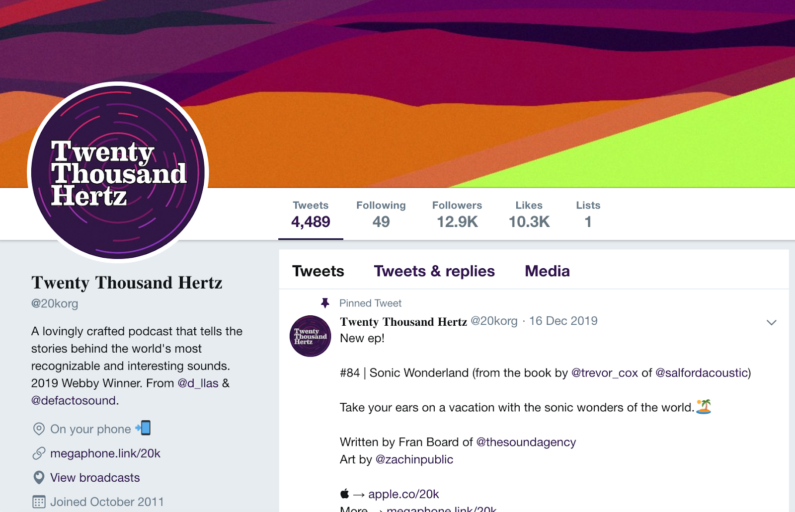
These two shows both lean into their hosts’s comedic personalities and incorporate that into the logos and names.
If it’s run by a celebrity, the thumbnail could feature a headshot of the host. Or maybe it uses some sort of lighthearted imagery to indicate that the show will make you laugh. Either way, a good logo is an instant taste of what the show has to offer.
While this isn’t true for all of the top shows, many podcast logos try to highlight the subject matter to attract listeners scrolling through iTunes, Stitcher, or any of the other thousand one one podcast apps.
In the end, this sort of approach is something every good logo does. It’s important to communicate your show’s intentions clearly, whether the podcast is brand new or a mainstream success. The name and logo should give some sort of cue to the subject matter.
Focus on the brand
Podcasts are a great way to add a new communication channel. They can be used to connect with an audience (for a content creator), to interview industry experts (for a business), or to spread a message (for a church). Literally anyone can start a podcast now.
But many of the best shows are ones that unify their branding across all services.

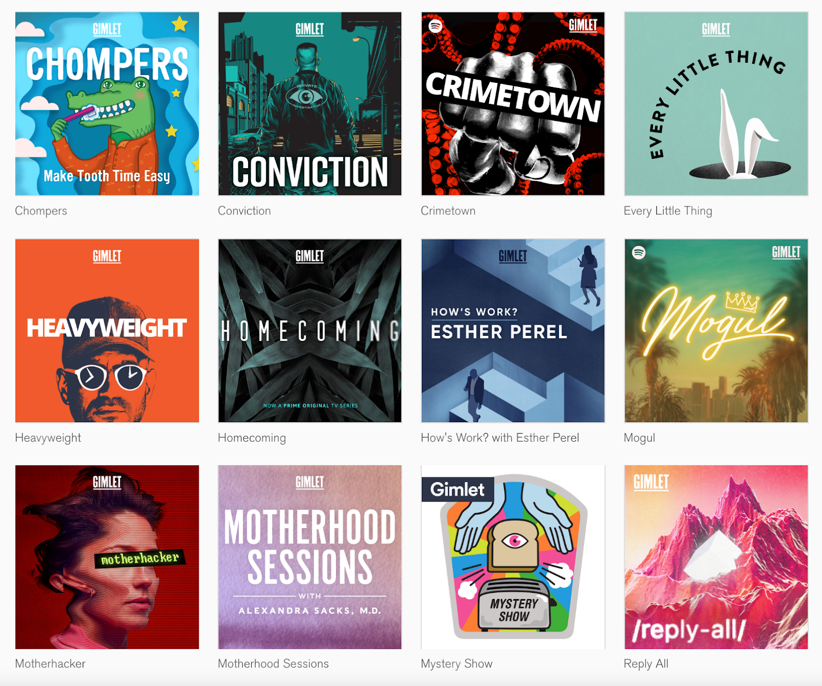
Take a look at the podcast catalog from Gimlet Media. There are similar elements and ideas that create a cohesive look.
Another thing to remember is that podcast networks — like NPR, BBC Radio, and Radiotopia — include a handful of shows in the same family. Those podcasts tend to create cohesion with similar colors, fonts, or designs, all in an effort to reinforce a universal brand.
Add a personal touch
Before you complain that this step is counter-intuitive, here’s the thing: Listeners might choose a podcast for its topic, logo, name, or one of a dozen other reasons, but they ultimately stick around because of the host(s).
The top shows find little ways to incorporate a touch of personality into their logos. That could mean adding a little humor, or even using a specific color to create a certain feeling or emotion. (Yes, color psychology is a thing. And it’s fascinating.)
While a logo provides a snapshot of the show, podcast hosts know it can also be a way to establish a personal brand in a way that a name might not.
Keep the components simple
Successful podcasts approach their logo like Nike and their timeless, instantly-recognizable swoosh.
First and foremost, the best podcast logos are recognizable as a thumbnail, an Instagram profile picture, and a website header. The only way to get that is through thoughtful, clear design.

A simple podcast logo also translates to a recognizable social media brand.
In other words, these logos use as few words as possible (and usually just the name) in a font with big, legible letters. There’s also a tendency for sharp contrasts with the colors — another trick for keeping something recognizable even at a distance.
You’ll also notice a trend in the image and icon choices. Things are either very, very obvious, or unique without being complex. But an important thing is that even familiar features have just enough character to avoid being overused (and most of the top shows avoid icons altogether).
While showing off your awesome microphone might seem relevant, it’s also pretty cliche. That forces people to find creative ways to personalize their logos rather than create another “black mic on orange background” or “white headphones on light blue background” thumbnail.
Value the image quality
Nothing is worse than a designer putting hours of research and work into a project, only for the art to go live with a grainy thumbnail. Image quality matters to the person making the image, the person hosting the show, and to the listeners who have to look at that logo every week.
This characteristic might be low-hanging fruit, but good image quality is something great logos have in common because it’s a necessity.
Podcast logos are square JPEG or PNG files because that is literally a requirement to get on iTunes, which is still the most popular place to listen to podcasts. The image must also be between 1400 x 1400 pixels and 3000 x 3000 pixels, with a resolution of 72 dpi.
So yes, image quality is the easiest trait to notice because it’s something that iTunes, Spotify, and other listening services actually regulate. But nobody wants a low-quality image, and finding one “in the wild” is like a giant billboard warning you about the level of audio quality to expect.
That’s ultimately the most important thing to take away from this little study. While podcast logos can be very different in terms of colors and fonts, it’s easy to spot similarities within the design elements (or at least the ideas behind those components).
When it comes to developing, designing, or revamping a logo for your own podcast, make sure to keep all of these pointers in mind. You don’t want to copy and paste anything, but spotting what your favorite shows do well can help you create something you’re proud of.
Hopefully, it’ll resonate with your audience too.
