May 25, 2022
Figuring out what you want to include in the frame of every shot is crucial. It’s why you spend so much time developing storyboards, shot lists, shooting scripts, and the production design.
You want to make sure that the camera shots, angles, lighting, and other visual elements are all working together to tell the story in the right way — whether it’s a film, TV commercial, corporate video, etc.
But here’s the thing: To do this, you also have to account for how the footage will be formatted on-screen for the viewer. We’re talking about aspect ratio(s).
It’s easy to only think of an aspect ratio as the formula for an image’s width and height (because, to be fair, that’s exactly what it is). Choosing the aspect ratio is an essential means to an end — the end being that your footage shows up on-screen without being distorted.
However, as many filmmakers have demonstrated over the years, aspect ratios are also effective storytelling tools.
This post serves two purposes:
- To share three ways that you (like other filmmakers) can use aspect ratios more creatively, and
- To make finding the right aspect ratio even easier for you by providing a cheat sheet resource for filmmaking.
So, without further ado, let’s start with the basics.
The most common aspect ratios for film are...
16:9 (or 1.78:1)
If you’re ever in doubt, 16:9 (or 1.78:1) is the most common aspect ratio today — and there’s a few reasons why.
This widescreen aspect ratio is 1) compatible with most standard HD televisions and computer monitors and 2) can host videos that have a different aspect ratio without distorting the image.
1.85:1
When it comes to modern cinematography, 1.85:1 and the next aspect ratio in this list (2.39:1) are both standard options for filmmakers to use.
This aspect ratio has a smaller width than the 2.39:1 aspect ratio, which means that everything on-screen will be shown in a widescreen view but not as wide as the latter option.
2.39:1
The 2.39:1 aspect ratio is often referred to as “CinemaScope” or “anamorphic widescreen format.” Because of the width of the frame size, this aspect ratio is really ideal for those wide cinematic shots of landscapes in films.
And, again, this is the other standard aspect ratio to be used by modern filmmakers.
1.9:1 (IMAX)
The 1.9:1 aspect ratio, or the IMAX aspect ratio, is the best option for films and media that will be projected onto large screens — ergo, IMAX theaters. This format essentially allows viewers to see more of what’s happening on-screen.
4:3 (or 1.33:1)
This aspect ratio was used in the earliest films and television shows (think of those boxy TVs with the square screen). Over the years as filmmakers wanted to create a more widescreen appearance, this aspect ratio became less and less common.
However, it’s still used for creative and thematic purposes by filmmakers (as you’ll see when we discuss the 2014 film “The Grand Budapest Hotel” later).
1.37:1
The 1.37:1 aspect ratio is an honorable mention in this list, especially since it’s often referred to as the Academy ratio. The story goes that in 1932, the Academy of Motion Picture Arts and Sciences approved this ratio and made it the standard option.
How to use aspect ratio to your advantage as a storyteller
Choosing an aspect ratio is a logistical decision, sure, but it’s also a creative one. Here are three ways (with examples) that you can use different aspect ratios to tell a better story.
1. Understand the film history of aspect ratios
If you trace back the history of aspect ratios, you’ll notice a gradual progression toward wider screens. This happened over several decades, which is why films from the 1930s are formatted so differently than films from the 1990s.
One way that you can get more creative with aspect ratios is by using this history to your advantage — like Wes Anderson did when directing “The Grand Budapest Hotel” (2014).
Take a look at these two images from the film.
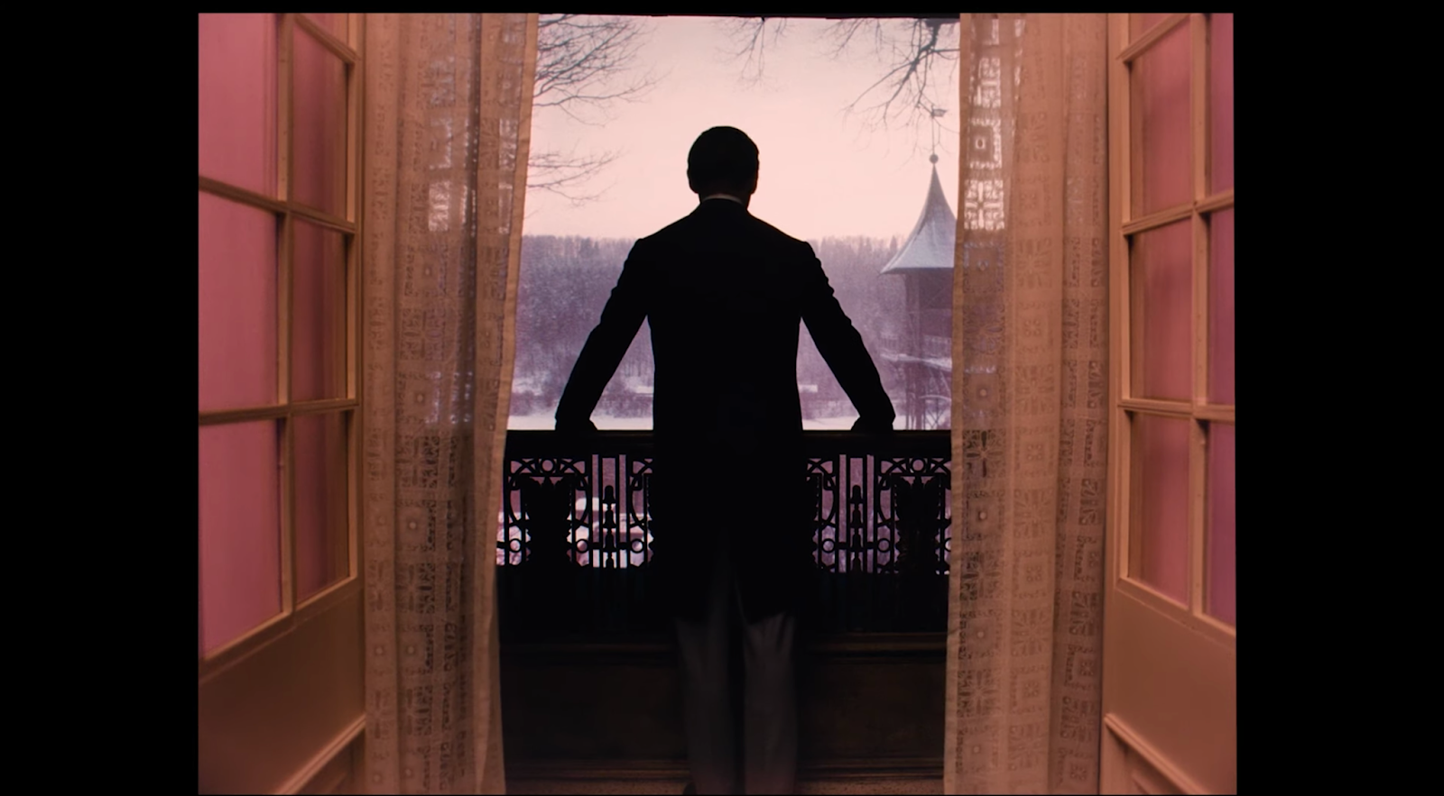
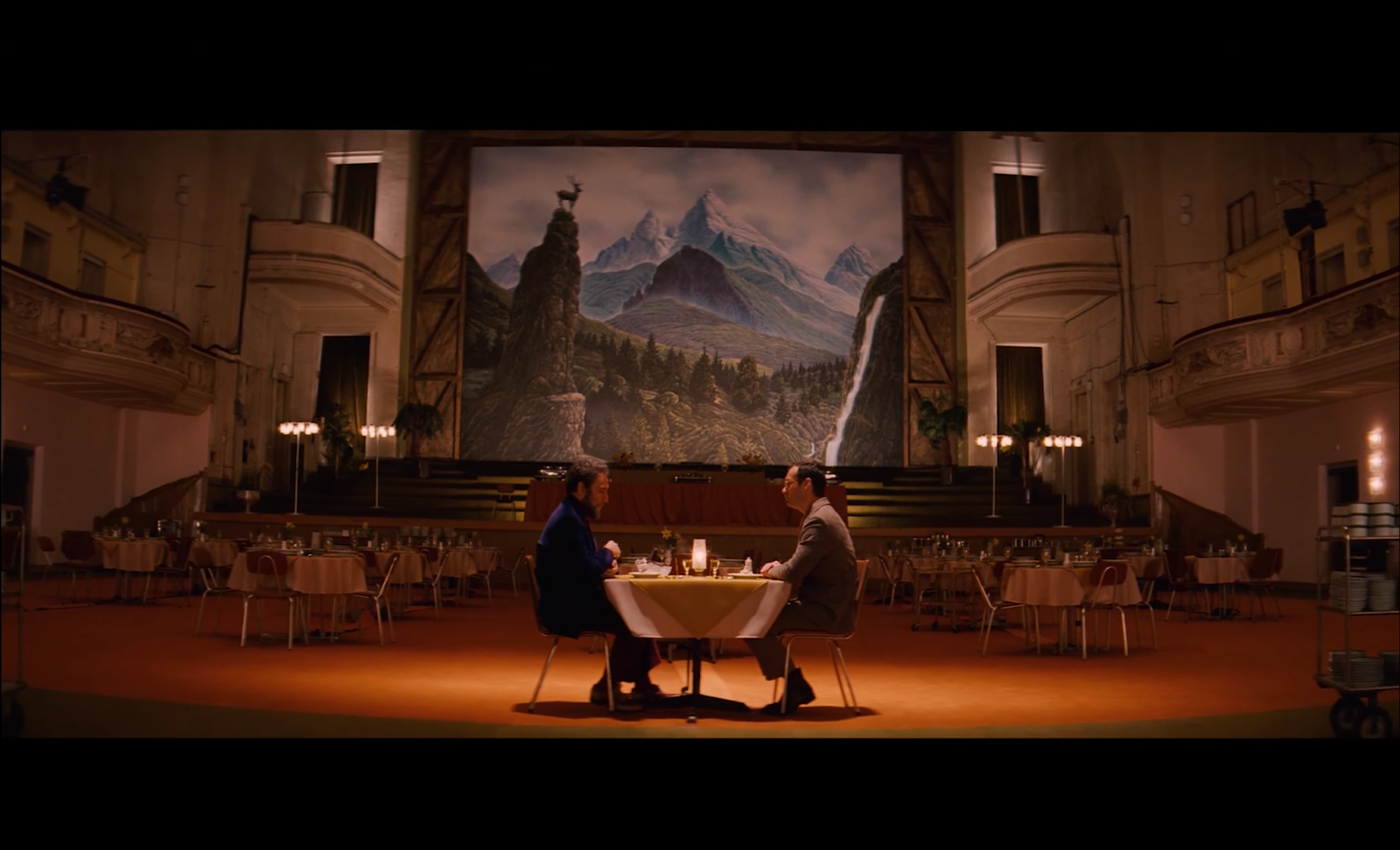
These two scenes are set in different time periods (i.e., 1932 and 1968) and are framed with a 1.33 and 1.85 aspect ratio, respectively.
But why?
Well, Anderson chose to use these aspect ratios because they would have been used by filmmakers at each of those time periods. Another part of the film is set in the 1980s, and it’s also presented to viewers with a different aspect ratio (2.35).
This intentional choice on Anderson’s part added more character to the film and made it easy for viewers to follow the characters throughout different time periods.
2. Think outside of the aspect ratio box
When it comes to aspect ratios, sometimes you can break the rules and bring what’s happening in-frame out of the frame.
Director Ang Lee did exactly that in the scene below from “Life of Pi” (2012):
Notice how several flying fish enter into the frame from the bottom of the screen, crossing over the black bar. This is a significant creative choice for many reasons, but the main one is that it defies expectations.
Viewers expect what’s happening on-screen to remain within the aspect ratio parameters, so when you do something like this, you surprise your audience in a really unique and visually engaging way.
But this is an uncommon technique for a reason. While this isn’t something you will use often, it’s helpful to see examples of how breaking convention can be another creative tool in your belt.
3. Use aspect ratios to signal a major narrative shift
Something else to keep in mind is that changing from one aspect ratio to another doesn’t have to be subtle. Like director Sam Raimi did for the 2013 film “Oz The Great and Powerful,” you can transition from a 4:3 aspect ratio to a 2.35:1 ratio to signal a major narrative shift.
Notice how these two images from the same scene have distinctly different aspect ratios:
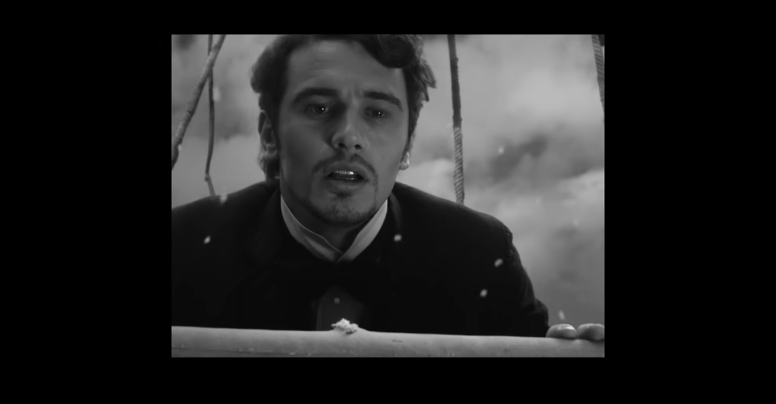
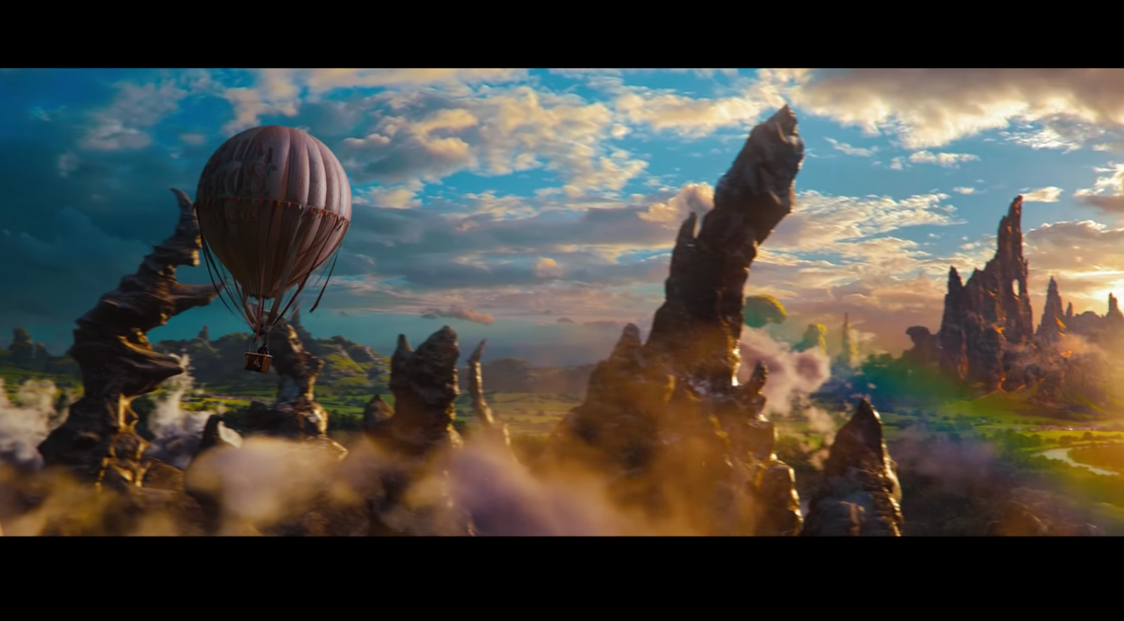
As Oscar Diggs (James Franco) arrives in the Land of Oz, the frame widens to a 2.35:1 aspect ratio, and the black-and-white format is simultaneously replaced with vibrant colors.
This transition from one aspect ratio to another completely transforms the visuals on-screen and shows a major thematic shift as well. But it’s a visual storytelling technique, not an accident or mistake. So keep that in mind before you start changing aspect ratios in every other scene.
A guide to aspect ratios and resolutions for film
Now that we’ve covered how you can use aspect ratios as a storytelling tool, let’s get into the nitty gritty of formatting your video or image with the right aspect ratio and resolution.
4K
|
Aspect Ratio |
Resolution |
|
1.85:1 |
4096 x 2214 |
|
2.39:1 |
4096 x 1714 |
|
16:9 (or 1.78:1) |
4096 x 2304 |
|
1.9:1 (IMAX) |
4096 x 2160 |
|
4.3 (or 1.33:1) |
4096 x 3072 |
4K UHD
|
Aspect Ratio |
Resolution |
|
1.85:1 |
3840 x 2076 |
|
2.39:1 |
3840 x 1607 |
|
16:9 (or 1.78:1) |
3840 x 2160 |
|
1.9:1 (IMAX) |
3840 x 2021 |
|
4.3 (or 1.33:1) |
3840 x 2880 |
8K
|
Aspect Ratio |
Resolution |
|
1.85:1 |
8192 x 4428 |
|
2.39:1 |
8192 x 3428 |
|
16:9 (or 1.78:1) |
8192 x 4608 |
|
1.9:1 (IMAX) |
8192 x 4320 |
|
4.3 (or 1.33:1) |
8192 x 6144 |
8K UHD
|
Aspect Ratio |
Resolution |
|
1.85:1 |
7680 x 4151 |
|
2.39:1 |
7680 x 3213 |
|
16:9 (or 1.78:1) |
7680 x 4320 |
|
1.9:1 (IMAX) |
7680 x 4042 |
|
4.3 (or 1.33:1) |
7680 x5760 |
1080P
|
Aspect Ratio |
Resolution |
|
1.85:1 |
1920 x 1038 |
|
2.39:1 |
1920 x 803 |
|
16:9 (or 1.78:1) |
1920 x 1080 |
|
1.9:1 (IMAX) |
1920 x 1011 |
|
4.3 (or 1.33:1) |
1920 x 1440 |
720P
|
Aspect Ratio |
Resolution |
|
1.85:1 |
1280 x 692 |
|
2.39:1 |
1280 x 536 |
|
16:9 (or 1.78:1) |
1280 x 720 |
|
1.9:1 (IMAX) |
1280 x 674 |
|
4.3 (or 1.33:1) |
1280 x 962 |
If you want to see an even more comprehensive breakdown of aspect ratios and resolutions, check out this aspect ratio cheat sheet.
And to help you streamline your production process even more, we’ve created more free templates for you to download and use whenever and however you want. Take some time to check out our shot list template, call sheet template, and storyboard template.