How to Make a Captivating Title Sequence
Mackenzie Scott
Mackenzie Scott
Jan 5, 2022
These days with streaming platforms, it’s easier than ever to skip past the title sequence (i.e., opening sequence) and get right to the story. In fact, on a platform like Netflix, all you have to do is press the “Skip Intro” button and voilà — you’re all set.
From the production side of things, this can be disheartening for any creator. After all, you spend a lot of time in post-production mixing audio, adding motion graphics, and putting finishing touches on intro sequences.
You want the audience to be captivated and hooked from the beginning — and maybe even think to themselves, “Now that was a good title sequence.”
To create title sequences that are too good to skip, it helps to know how other filmmakers have experimented with visual design and editing styles throughout cinema history. That’s why we’re featuring six of the best title sequences in this guide.
So, without further ado, let’s cover the basics.
A title sequence consists of two key elements: a title card (which is usually shown for less than 12 seconds) and the opening credits. For filmmakers and other creators, this sequence introduces the project and pays tribute to the main figures involved in production.
The purpose of a title sequence is to credit the principal cast, crew, production company, etc., but also to set the tone for the film or TV show itself. In the early days of cinema history, this typically meant scoring an intro theme and pairing the music with a static background and opening credits (see the example from Casablanca).
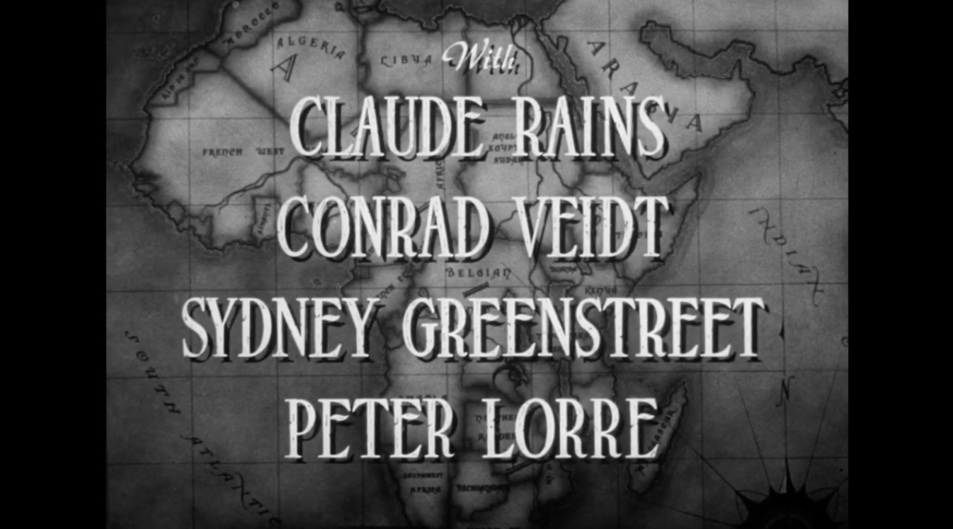
As software and editing techniques evolved, however, filmmakers started looking for ways to take their title sequences to the next level and create a more captivating viewing experience.
With the help of graphic designers like Saul Bass — i.e., the genius behind the opening sequence for Alfred Hitchcock’s Psycho — filmmakers began viewing title sequences as a storytelling tool, not just as a vehicle for information.
If a film has a suspenseful and disturbing storyline (like Psycho), then the filmmaker can foreshadow this in the opening sequence via the visual design and music. The same rules apply for any other genre in TV or film.
What matters most these days — especially since title sequences are skippable on streaming platforms — is that an opening sequence serves a thematic purpose and sets the tone for the rest of the project.
The options are practically endless for today’s creators when making a title sequence. You could go all out with complex motion graphics and animation or — like director Jared Hess did for Napoleon Dynamite — take a far more unconventional approach.

Over time, filmmakers and other creators have found new ways to present opening credits and title cards in their title sequences. (You can see this in the earlier examples from Casablanca and Napoleon Dynamite.)
But even though the editing styles and design preferences are different now than they were in the 1940s (or earlier), the one thing that has remained the same is the importance of music.
Whether you produce an original score or license music elsewhere, what ultimately matters is that the music in the title sequence is a good thematic fit for the project.
Title sequences are brief (and typically less than two minutes long) but can still incorporate a lot of different visual elements. This includes typography, production design, lighting, color scheme, shot footage, still images, motion graphics, and more.
The video quality of a title sequence is extremely important, especially since the title sequence is the first thing that viewers see when watching a film or TV show. If the quality is low in these first couple minutes, this can lead to a bad first impression of your project.
To avoid this type of audience reaction, you should invest in a good lighting setup, audio equipment, and video editing monitor. That way, you can capture and edit better quality footage in post-production (and integrate the music you produced or licensed at the same time).
Filmmakers and creators — like anyone else — can feel the effects of a concept called the “paradox of choice.” Because there are so many ways that you can design and score a title sequence, it can be overwhelming to just choose one.
Ultimately, it’s up to you and your team to answer this glaring question: “Which title sequence style is the right one for our project?”
The more familiar you are with different title sequence styles, the easier it can be to answer this question.
If you’re looking for some inspiration, you’ve come to the right place. Let’s take a look at six of the most memorable title sequences in film and television history and then discuss why they’re noteworthy in this list.
The Shop Around The Corner is a 1940s film that was set in Budapest and directed by German director Ernst Lubitsch. This film’s opening title sequence is a classic example of how filmmakers in the 30s and 40s chose to introduce a movie title and opening credits to audiences.
Like Casablanca and many other films of that era, the title sequence’s primary purpose in The Shop Around The Corner is to credit the cast and crew members. To stick with that focus, this example pairs a simple background design with a clear emphasis on the opening credits and film score.
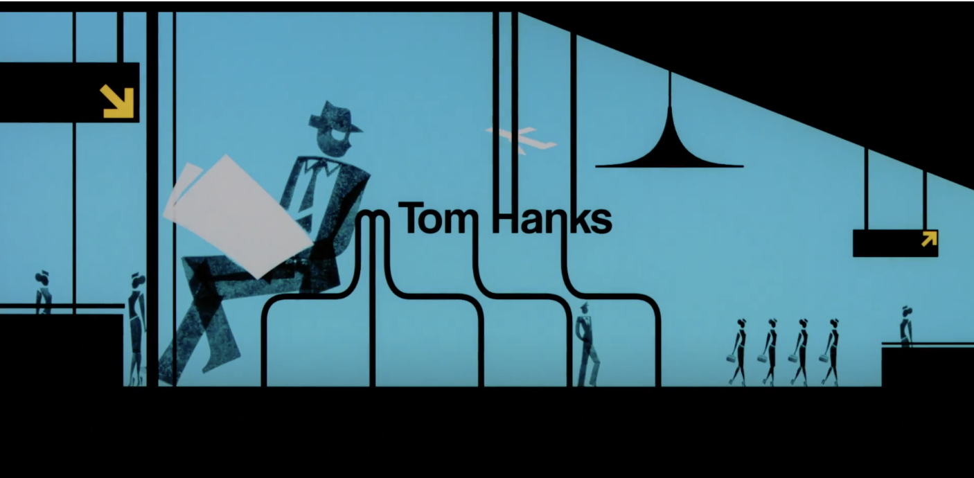
This iconic title sequence was designed by Florence Deygas and Olivier Kuntzel, who took inspiration from the graphic design style of Saul Bass. You can see Bass’s influence in the minimalistic shape design and “kinetic type” (aka the moving words).
What stands out in this opening title sequence is the way that the music and visuals work together on-screen. Deygas and Kuntzel use the title sequence to tell a story that foreshadows the film’s plot.
We, as the audience, watch as Leonardo DiCaprio’s character takes on new disguises and evades Tom Hanks’s character (pictured below).
The Star Wars series is a cult favorite among sci-fi fans and cinephiles, and it has one of the most well-known and recognizable scores of all time.
In this title sequence for Revenge of the Sith, the filmmakers open with the classic line “A long time ago in a galaxy far, far away…” and then immediately transition to the title card and opening crawl.
Unlike the title sequence in Catch Me If You Can, this opening sequence features an opening crawl that explains the events that happened leading up to the first scene in the film. It sets the scene but doesn’t foreshadow what will happen next.
All the while, John Williams’ theme plays in the background — immediately ushering in a feeling of excitement and adventure for audiences.
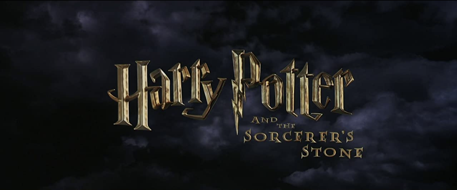
Harry Potter is another notable series in modern film history, especially when it comes to the topic of title sequences. Each of the eight films has a different version of the opening sequence — beginning with the one pictured above.
As you can see in the video below, the same core components were included in all of the films’ title sequences: the Warner Bros. Pictures logo and the movie title. But the visual design and presentation of these components are always different.
For Harry Potter and the Prizoner of Azkaban, the title card is brightly illuminated with bright metallic letters. As the series progresses, however, the Warner Bros. logo and title card is visually rusted or shrouded in darkness.
These design changes are meaningful because they establish a clear theme and tone going into each film.
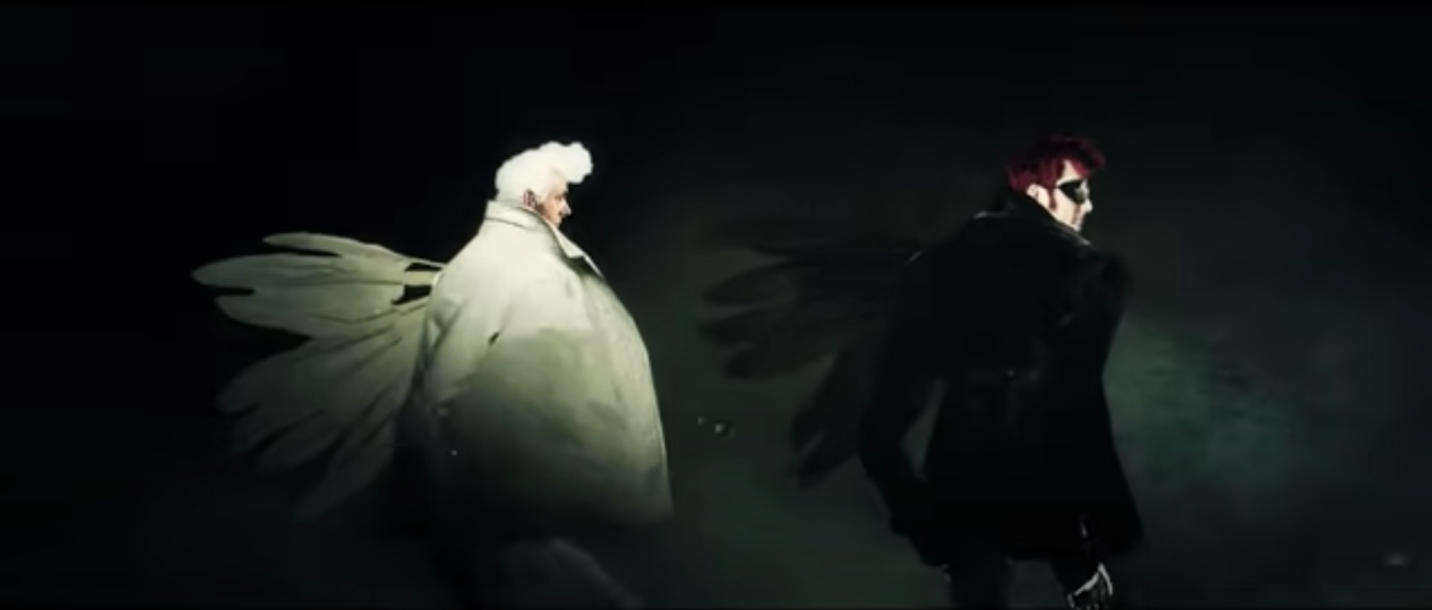
Produced by Amazon Studios and BBC, Good Omens is a streamable series that has been adapted from Terry Pratchett and Neil Gaiman’s novel by the same name.
The visual design of this title sequence is eye-catching and dare-I-say remarkable, but that’s not the only reason it’s effective. Like Catch Me If You Can, the opening sequence is narrative-based and follows the two main characters in the series, Aziraphale (Michael Sheen) and Crowley (David Tennant).
Actually, this one might be better appreciated if you see it in action:
In an interview, the show’s Art Director Red Isaac had this to say about the title sequence:
“The piece needed to communicate the main narrative of the series — the coming of Armageddon — but also the comical and fantastical tone, the friendship between the two leads, good and evil and its presence in everyone, the huge cast, both in numbers and characters…”
As you watch this title sequence, you can see how this vision came to life through 3D animation, 2D illustrations, live-action elements, and a lively score.
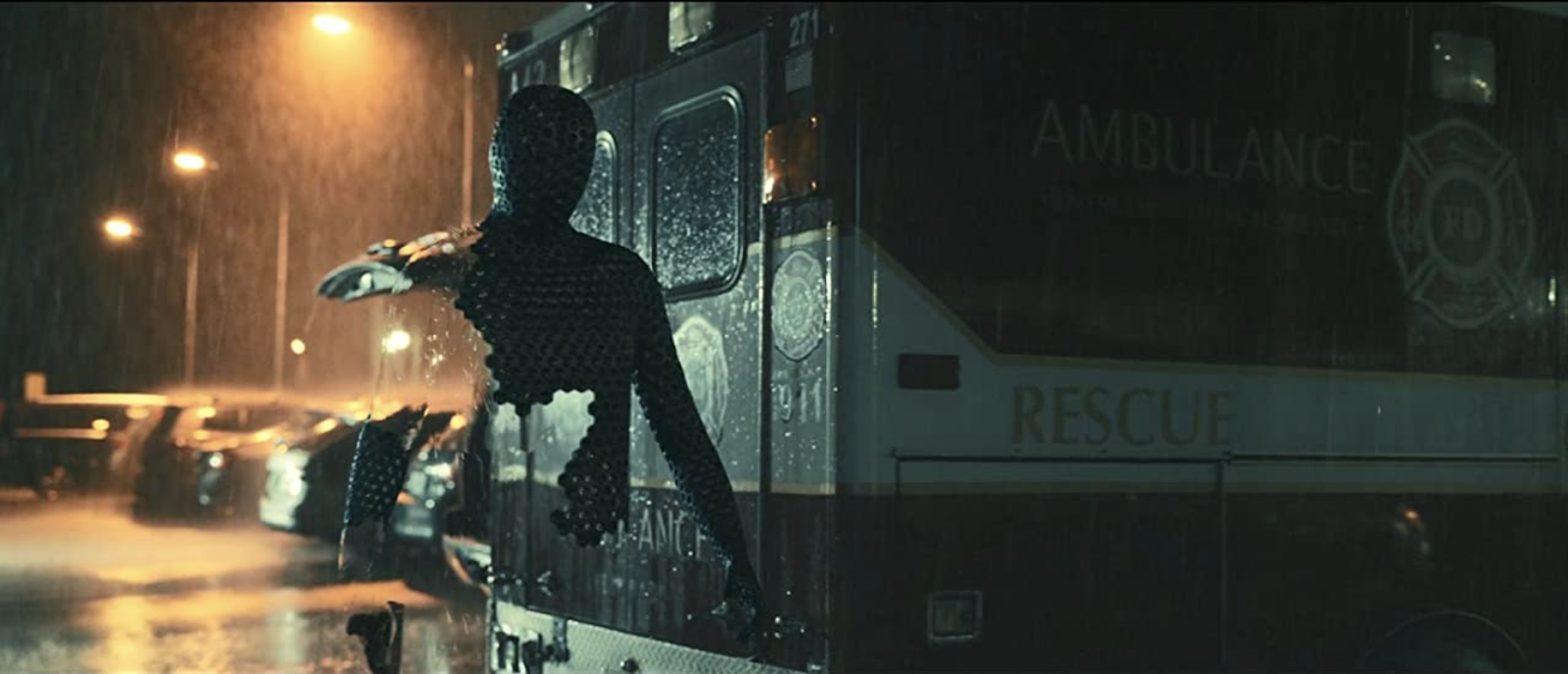
The opening title sequence of The Invisible Man is different from all of the other examples in this list.
In the video below, notice how the film opens with footage of ocean water breaking against large rocks over and over again — and how each time this happens, a new line of the opening credits is revealed.
After the title is shown, the opening sequence transitions to a black screen that lists out each of the principal cast and crew members.
This title sequence foreshadows the main conflict in the film and creates a feeling of suspense in these specific ways:
All in all, this opening sequence sets the stage for what’s to come in a haunting and effective way.
When it comes to opening title sequences, you have a lot of creative freedom with how you present the title card and opening credits. Stylistically, you can take a conventional approach (like Casablanca) or an unconventional one (think Napoleon Dynamite).
At the end of the day, every great title sequence has a good hook, visual design, and score. When all of these elements are tied together thematically, you’re able to create a title sequence that adds value to the viewing experience.
If you want to foreshadow something in your film, consider making an opening sequence like the one in Catch Me If You Can. If you want to establish a specific mood and theme early on, get inspiration from the title sequences in Good Omens and The Invisible Man.
For more inspiration, find a graphic designer that you admire and study their art. Watch different types of films or series and pay attention to the opening credit sequences. From there, you can experiment with title design and animation to create a highly memorable title sequence of your own.
This guide has showcased a few of the most iconic title sequences, but there are plenty more to watch and get inspired by. Whether for a film, TV show, or other project, you have the tools and resources to create a captivating title sequence that your audience won’t want to skip.
The title sequence — while extremely important — only takes up a small percentage of airtime in a film, TV show, or video project. If you’re interested in what comes after the opening credits, these articles from the Soundstripe blog cover a wide range of filmmaking topics: